The Brief
Rate Broker was a startup that had a new idea on how to get a mortgage. I was tasked with helping build their initial brand, developing a digital strategy and creating the User experience.
The Why?
Currently when you want borrow money either for a house or car you go to your nearest vendor or convenient bank and most like pay market rate.
What rate broker will do is change that way of thinking and it’s a free service for the borrower.
Now when you want to borrow money you go on the rate broker site and create a profile and answer 15 or so questions and within minutes a rate broker tender is up. This is a private tender and the lenders can only see your login name until the final lender is chosen.
The Who
Three kinds of user
user a) User who can fill out a tender/accept
user b) bank or broker
user c) Administrator who can manage all content of site
The What
A clear brand was developed along with a website that when logged in required a place where you could place tenders online. This required an admin control area and a broker facing dashboard as well.
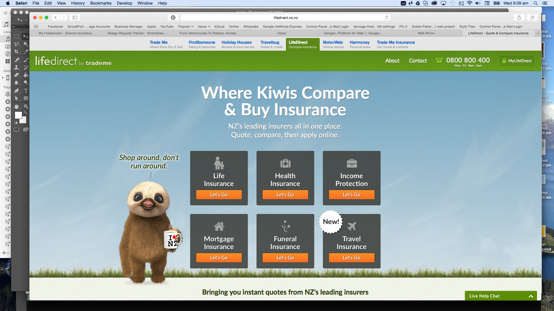
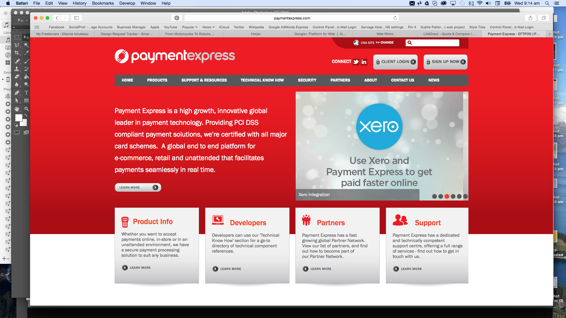
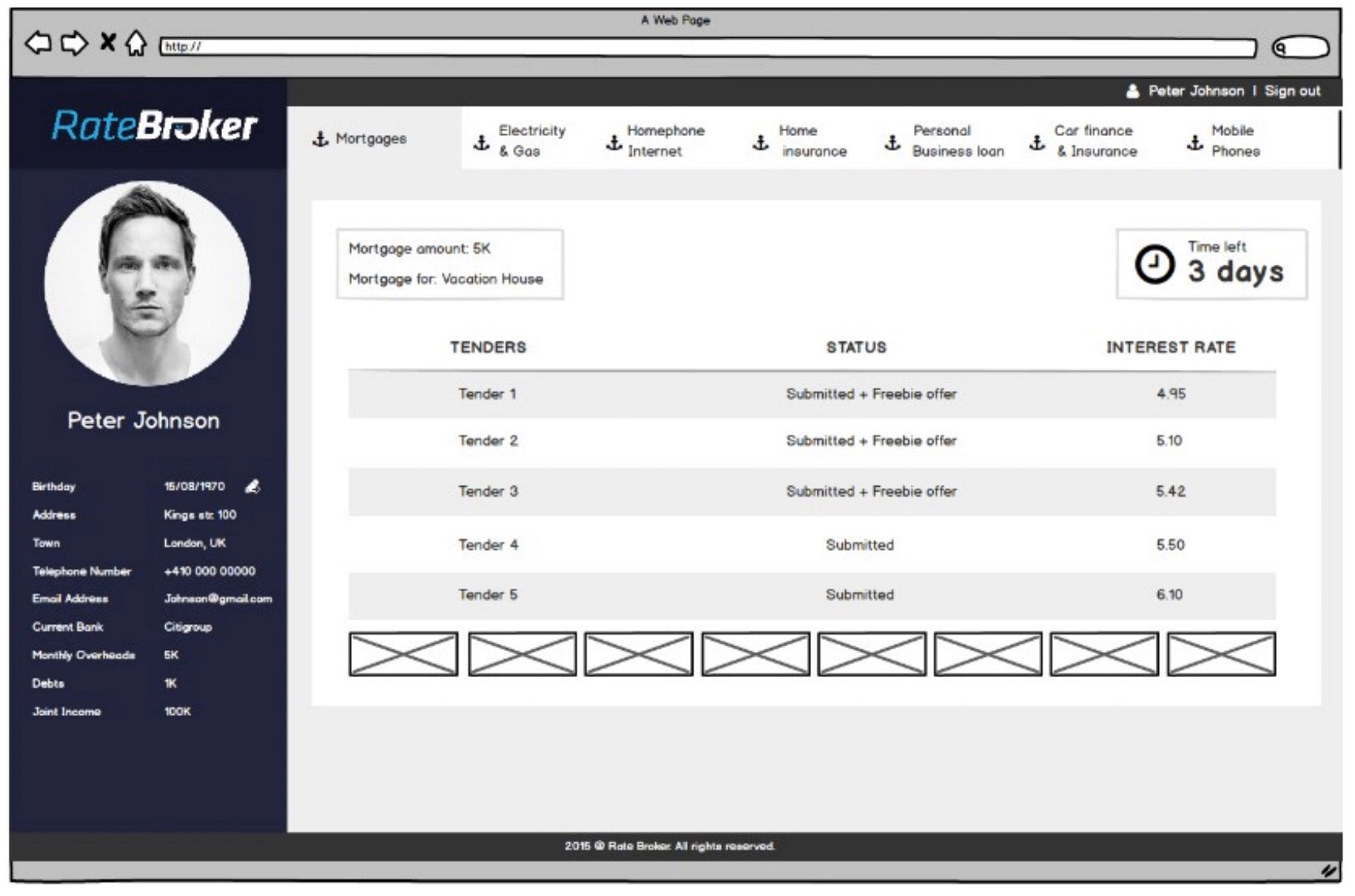
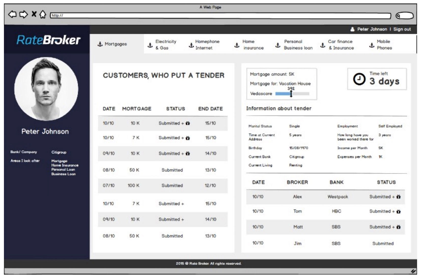
Stake holder interviews and competitor analysis then helped me to form a site map and wire frames for the design.
Competitor analysis


Site map
Lo-fi wire frames


These were put into a prototype and then tested with a small focus group. From their the hi fidelity designs were created.
The work I did allowed Ratebroker to make a significant impact on the market, they have since been purchased by a larger corporation and are still going strong today.